I
Identity System
Bold. Striking. Confident.
The cornerstone of the expansive TU identity system is its logo. Bold, striking, and confident—it establishes an unapologetic sense of ownership over these two simple letters. It is a stamp of confidence that captures both pride and possibility. As a complementary and versatile identity element, we unleashed the fiercely unique “tiger tooth” pattern, which permeates much of the brand implementation. Carefully considered angles (these correspond with the “T” and “U” custom type) were inspired by the diagonal, checkerboard design seen on the Maryland flag. Together, the logo and tiger tooth elements support an identity system that feels bright and youthful, yet sophisticated.
Logo
Identity
Style Guide
II
Brand Execution
A Brand Fully Activated.
Hold it. View it. Wear it. Let it surround you. The TU brand is at home in any application, from the university president’s business card to a giant, free-standing interactive sculpture.
Stationery
Collateral
Apparel
Environmental
Signage
III
Brand Site
Expounding Art & Science.
The TU brand is mobilized by a vast contingent of internal users and external partners, making consistent utilization a top priority. We worked with the TU Brand Team to develop a website that indexes every identity guideline and technical tidbit clearly and intuitively. The site stays true to the brand voice, leading by example and demonstrating the confidence and excitement that lies at the nexus of the new TU identity.
Website Design
Wireframing & User Experience
Responsive Programming
IV
Brand Awareness Campaign
A Purposeful Reintroduction.
We unveiled the new TU identity to external audiences with a Brand Awareness Campaign that was simple, focused, and confident in its message. Imagery featuring exuberant human emotion, paired with short, energetic phrasing, connects with the viewer in a visceral way. Our campaign reached a broad audience through a mix of traditional and digital marketing, and we supported their admissions with a heavier concentration of media in areas that overlapped TU’s geographic prospective student profile.
Strategy
Digital Marketing
Design
Traditional & Out-of-Home Advertising
Social Media
On-Campus Awareness
Those who frequent our campus are our greatest ambassadors. We want students, faculty and staff to burst with pride, and put their enthusiasm behind the momentous growth happening all around the university. Showcasing our big, new TU within the campus environment brings it together as a symbol that unites us.
Public Awareness
We understand that there are varying degrees of awareness and a myriad of perceptions of Towson University. We used simple imagery to confidently communicate our University's progress and momentum, and to place the opportunities we provide our students boldy at the center of our brand and our reason-for-being.
V
Athletics Awareness Campaign
Two Logos, One Brand
Though TU has a separate logo for their Athletics division, we're always careful to reinforce the school's unified commitment to its vision through brand cohesion across marketing materials. When we were asked to assist with campaigns to support TU's football and basketball programs, we prioritized consistent brand language and the same confident and welcoming voice as our brand awareness push. We wanted to raise awareness for these athletic programs, and ultimately increase ticket sales. To meet these goals, we led with creative that captured the excitement of attending sporting events, and adapted TU's visual brand identity to reflect the energy of the TU athletes. We helped TU define highly targeted audiences for both campaigns in order to maximize digital engagement.
Strategy
Digital Marketing
Design
Traditional & Out-of-Home Advertising
Social Media
VI
Admissions Conversion Campaign
Consistent. Measurable.
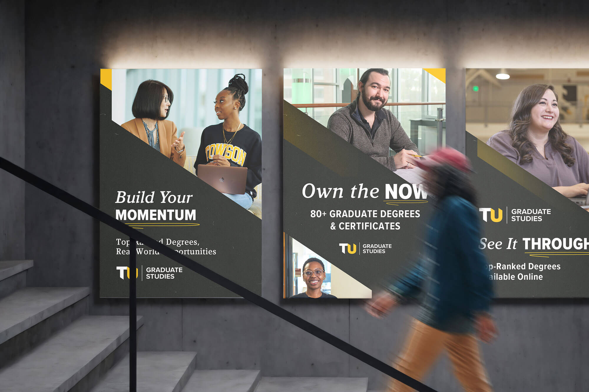
Alongside the generalized Brand Awareness Campaign, we launched a four-phased Undergraduate Admissions Campaign. With conversational calls-to-action and conversion metrics by phase, we evoked the feeling of a virtual introduction for prospective students and parents, and maintained the ability to make creative adjustments from phase to phase. By carefully segmenting the undergraduate audiences, we were able to craft messaging specific to parents, students, out-of-state families, and in-state families, further "personalizing" the communication. As a bit of icing on the campaign cake, we launched a Graduate Program Awareness Campaign, using highly specific messages to highlight the breadth of educational opportunities at TU.
Strategy
Digital Marketing
Design
Traditional & Out-of-Home Advertising
Social Media
VII
Alumni Magazine
Sharpening a Key Communications Tool.
By this point, we thought we knew just about everyone on staff with the TU Communications Department. But with the opportunity to work with the editorial staff on the latest edition of the TU Magazine, our partnership grew even wider. In this long-form piece, catering to an alumni audience, we were able to explore and expand the new TU brand through custom illustration, additions to the brand palette, defined photography styles, compelling text treatments, and layered patterning. This design direction, married with a dynamic editorial style, resulted in a product that’s informative, exciting, and entertaining—a perfect way to showcase post-grad TU pride.
Publication Design
Illustration
Page Layout