Skip to Main Content
MISSION
Heart. Mind. Gut.

Back To News

5 Tips for Creating Accessible Content for Social Media

We are firmly planted in the digital era. As we look around at the many ways accessibility has advanced in the physical world, we should also be prioritizing digital spaces. In this article, we'll explore five ways you can make your social media content more accessible. 

1. Use Alt Text, Always

One common method used to aid people with visual impairment is alternative text, or alt text, on posts that feature an image. Alt text is a short description of an image that helps people who use a screen reader to know what's being shared. Almost all social media platforms offer the ability to add or update automatically generated alt text.

It's up to you to determine what's important to emphasize within the image, but here are a few tips to consider when drafting alt text:

  • Include the essentials. If it was important enough to show in the photo, it should be described in the alt text.
  • If there's text in the image, make sure it's also in the alt text. 
  • No need to include “a photo of…” or “an image of…,” jump right into the description.
  • Remember, this is highlighting what the image conveys, not just what it contains.
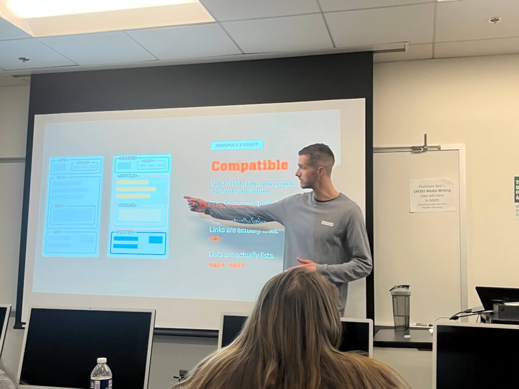
A man points to a presentation slide titled 'Compatible' with graphics representing accessible code.

Bad alt text: an image of someone pointing

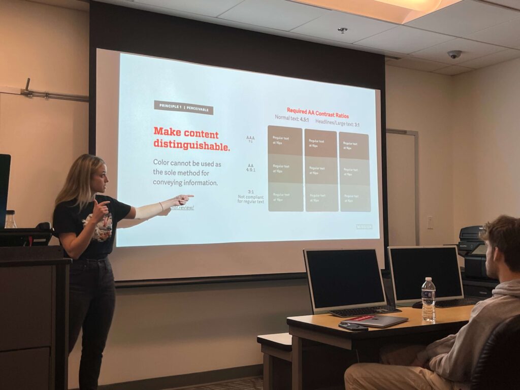
A woman pointing at a projected screen that reads 'Making content distinguishable' during an accessibility presentation at Loyola University.

Good alt text: a woman pointing at a projected screen that reads 'Making content distinguishable' during an accessibility presentation at Loyola University.

For more help writing good alt text, check out our Mission Alt Text Flow Chart!

2. Be Thoughtful with Your Text

People who are navigating social media platforms with the help of screen readers are fully reliant on the words that are typed out, so be considerate of what and how you're typing. 

Some of the ways text can be accessible is through proper hashtagging, not typing in all uppercase, being considerate with font color, as well as the characters and typography you're using. When using hashtags, be sure to be case-sensitive with multiple-word hashtags. For example; use #AccessibilityRocks instead of #accessibilityrocks. 

Avoid typing in all uppercase letters as screen readers can read them as acronyms instead of the word itself. Be considerate of all characters and typography, including special characters, emojis, and even specialty fonts. They can lead to some very confusing readings from assistive technology


3. Captions Are Key

Many social media platforms offer their own voice-to-text caption options, but they don't always translate or spell everything correctly. Take the time to ensure your captions are not only accurate but also clearly visible and unobstructed by platform “buttons” (mostly for TikTok and Instagram Reels). Remember, these captions also add additional context to the video, like the music that's playing or any background noises.

These days, most people use social media with sound turned off. In fact, a survey of U.S. consumers found that 92% of all mobile users view videos with the sound off. This is a perfect example of how accsssibility is helpful to everyone, not just those with impairments.

4. Design Mindfully

Building on that last tip, make sure that your design is visually accessible. Consider the captions you just added to that TikTok video; did you make sure the text color properly contrasts the background color? Or will people who experience colorblindness be unable to read them? An easy solution would be to simply have white text on a black background. Be mindful of using particular effects in your content that could be harmful to some. Include warnings on videos that may include strobing light effects or slamming graphics. 

Color contrast examples: For AA the required contrast for text is 4.5. Headlines and large text needs at least 3.

Use online tools such as color.review to find the contrast ratio between text and background colors.

5. Everyday Accessibility and Inclusion

Make sure your content showcases inclusive representation. This includes describing people (race or ethnicity, gender expression, disabilities, etc.) in alt text. Beyond representation, descriptive language may offer useful context. Also, use inclusive language! If you've made an effort to ensure your content is accessible, make the same effort to ensure the language is too. Use person-first language, avoid biased or offensive language, and remember that language is always evolving, so continue to educate yourself on preferred terminology.

Ensuring accessibility is an ongoing effort, but with the right processes and people-focused values, it can be manageable. Make sure you're receptive to your users' feedback. If one person reaches out with a problem, they're probably not the only person who will benefit from the changes. Remember, it's best (and possible) to make your content more accessible for everyone! 


Dive Into Mission's Accessibility Blog Series

There's a lot to creating content that considers any and every user. To help round out your accessibility strategy (beyond social media), our blog series offers actionable tips and resources. Check out past entries below!

Part 1: Compliance Led By Compassion
Part 2: New Website, Who Dis? How to Manage Your New Website While Maintaining Accessibility
Part 3: A Few Words on Accessibility: How To Use Language That Works for More People
Part 4: Testing Websites For Accessibility and Overcoming Common Testing Issues