Redefining Ice as a Service, Not a Product
If you’ve ever gotten ice at a hotel or restaurant, you’ve probably interacted with Easy Ice without even knowing it. Founded in 2009, Easy Ice is the largest ice machine subscription business in the United States, with 47,000 machines currently in service and 28,000 clients across the country. As part of their model, they also fully manage the machines—handling installation, maintenance, and support, so customers never have to think about ice again.
As Easy Ice expanded their branch network to gain tighter control over the customer experience, it became clear that the brand needed to catch up with the business. The subscription model had real, tangible value, but the platform wasn’t communicating it clearly enough to drive connection. So, they tagged Mission to lead a refresh that would take them into their next era of growth.
The Ice Is the Easy Part
The work started with a reframe. Easy Ice isn’t selling machines—they’re selling reliability. Clean, consistent ice. A technician who shows up if something goes wrong. A relationship with a company that’s invested in keeping your operation running. The machines themselves (manufactured by top-tier suppliers and available in a variety of configurations) are the proof points rather than the product.
That distinction shaped how we talked about the brand and taught prospective customers. The temptation for anyone evaluating a subscription is to do the math: monthly fee versus cost of ownership. But that math misses what the Easy Ice model actually delivers. Our job was to move people to a fuller understanding of the value equation, accounting for service, expertise, and peace of mind.
We also needed to address a tension in Easy Ice’s growth story. The company is national in scale, but the service is deeply local. Their branch model is founded on local technicians and relationships with national infrastructure and accountability. Demonstrating how efficiency and economy of scale intersect with personal, local service became central to the new platform. National can be personal.
Evolution, Not Revolution
When a brand has equity with customers, throwing it out is just wasteful. The smarter move is to keep what’s working and let the rest melt away. For Easy Ice, that meant an evolution: refining the logo to reflect the company they are today rather than starting from scratch. The updated mark simplifies the visual system without abandoning it. Unnecessary complexity gives way to clarity, professionalism, and reliability—the same qualities at the center of the new platform. The evolved logo feels modern and service-first, and it’s built to carry Easy Ice forward for years to come.
One Brand, Many Audiences
The broader identity needed to resonate with a lot of people. Easy Ice is talking to customers, but also prospective employees, investors, acquisition targets, strategic partners, and industry influencers, each interacting with the brand in different ways and each with a suite of different needs. The identity system had to be flexible enough to be relevant across all of them.
We thought a lot about how it feels to be each of these audiences. For a restaurant, ice impacts service. For a hotel, guest experience. For healthcare environments, consistency and sanitation. A broken machine is never just a broken machine—it creates stress, disruption, and operational headaches. We wrote copy to reflect this understanding, balancing national scale and professionalism with a tone that still felt responsive, practical, and human.
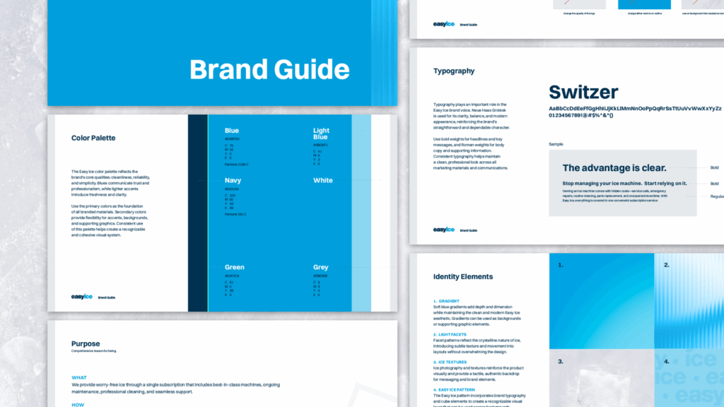
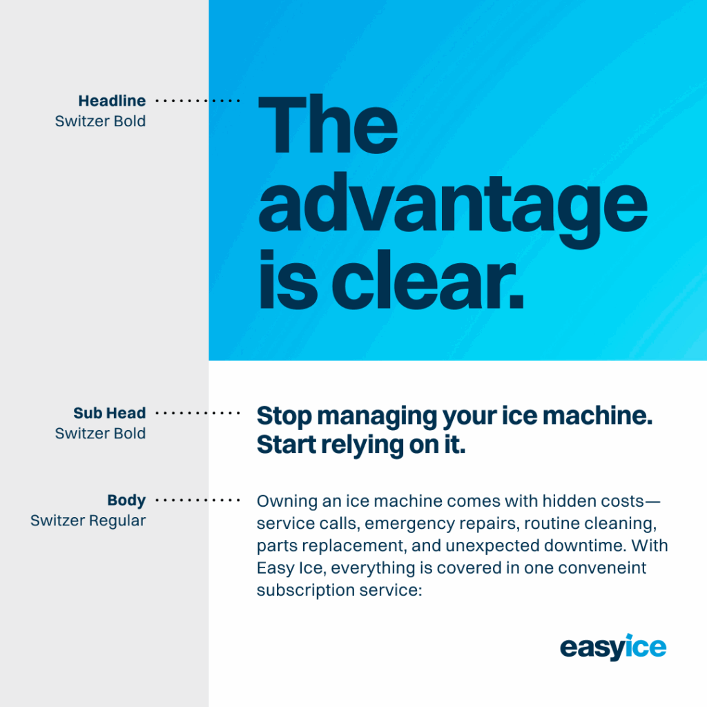
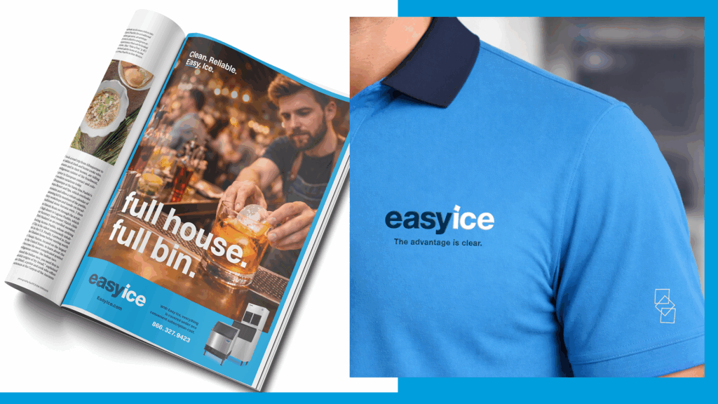
Meanwhile, on the visual side, the color palette grounds Easy Ice in their core qualities of cleanliness, trust, and reliability. Blues carry professional weight, while lighter accents introduce freshness and clarity. For our typeface, we chose the balanced and modern Neue Haas Grotesk (say that three times fast) to reinforce their straightforward character at every touchpoint.
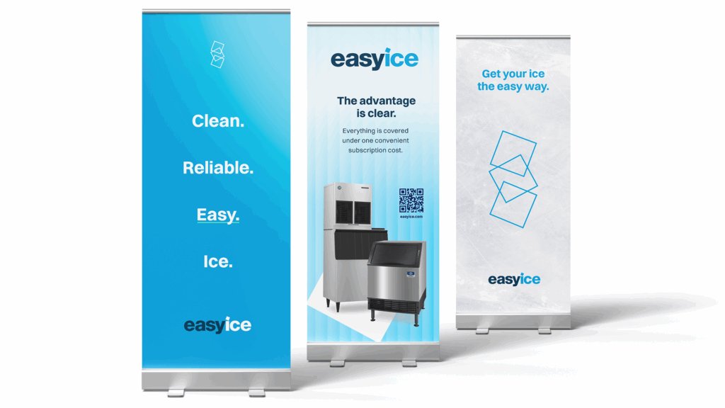
Beyond color and type, the system includes a range of graphic elements designed to reinforce what Easy Ice is about: stacked cubes, single cubes, gradients, light facets, ice textures, and a proprietary Easy Ice pattern. These tools give the brand visual consistency and flexibility across contexts, from trade materials to digital to signage.
Strategy Made Crystal Clear
A brand is only as strong as the strategy behind it. Things like identity systems, logo marks, and color palettes don’t matter unless they’re grounded in some truth about who a company is and where it’s going. For Easy Ice, that truth was straightforward: they’re not a product company, they’re a service partner. The refresh didn’t invent that. It just made it impossible to miss. And when a brand finally reflects the business it represents, everything—perception, trust, growth—gets a little easier.
From positioning to identity, we help brands become clearer, sharper, and harder to ignore.
Get In Touch