I
Brand Refresh
Borrowing from the past. Creating a brand for the future.
The Phillips Seafood logo had equity, but the brand lacked the common voice and a solid identity system needed to unite its sub-brands and permeate future campaigns. We found a way to convey Phillips' rich history with modern energy, outfitting their communications with a cohesive voice and strong visual language.
Visual Language
Layout
Identity System
Style Guide
II
Strategy & Architecture
The Phillips Seafood brand encompasses three divisions: Restaurants, Grocery, and Foodservice–each with their own goals and target audiences. We lead key stakeholders through a series of workshops to distill the common denominators between these divisions, highlighting core values and the high-level emotions that drive the Phillips work ethic. Together, we framed the Phillips Seafood branded house, unifying all three divisions with a solid brand platform and a manifesto worthy of approval from the family matriarch herself, Shirley Phillips. From there, we explored value propositions and positioning language unique to each division. Bringing everyone together in the same room to share memories and realize a shared purpose really does wonders for internal brand building. It reminds us of a crab feast, actually.
Brand Architecture
Copywriting
Brand Positioning
III
Identity System Update
After minimal modifications to the already iconic Phillips logo, we dove headfirst into fresh typography, salivating photography guidelines, and an expanded color palette based on the Chesapeake Bay environs. It's not every day you get to name a color "Old Bay." We brought everything together with contrasting graphic elements that strike a delicious balance between nostalgia and modern sophistication.
Print Collateral
Giveaways
Restaurant Branding
Packaging
Traditional Advertising
Social
In-Restaurant Applications
Zeroing in on the restaurant brand division meant reimagining menus, table toppers, and carry-out packaging. We exercised the full range of the new Phillips color palette and introduced a classic and sophisticated monogram to the brand identity toolbox. In keeping with the welcoming, family-oriented Phillips persona, we used catchy headlines to spark Eastern Shore nostalgia and emotional connection.
100+
Years on the Water
Advertising & Social: Grocery Division
With updated print advertising, we demonstrated how the new and improved Phillips brand could solve the communication needs of one of the company's three major verticals. The Phillips Seafood Grocery division needed to motivate shoppers to share the Chesapeake Dining experience with their families. With careful consideration given to the informational hierarchy, we let the copy do the work. Headlines, supported by delicious photography, helped shoppers imagine bringing their families together for a memorable Phillips Seafood experience.
IV
User Experience
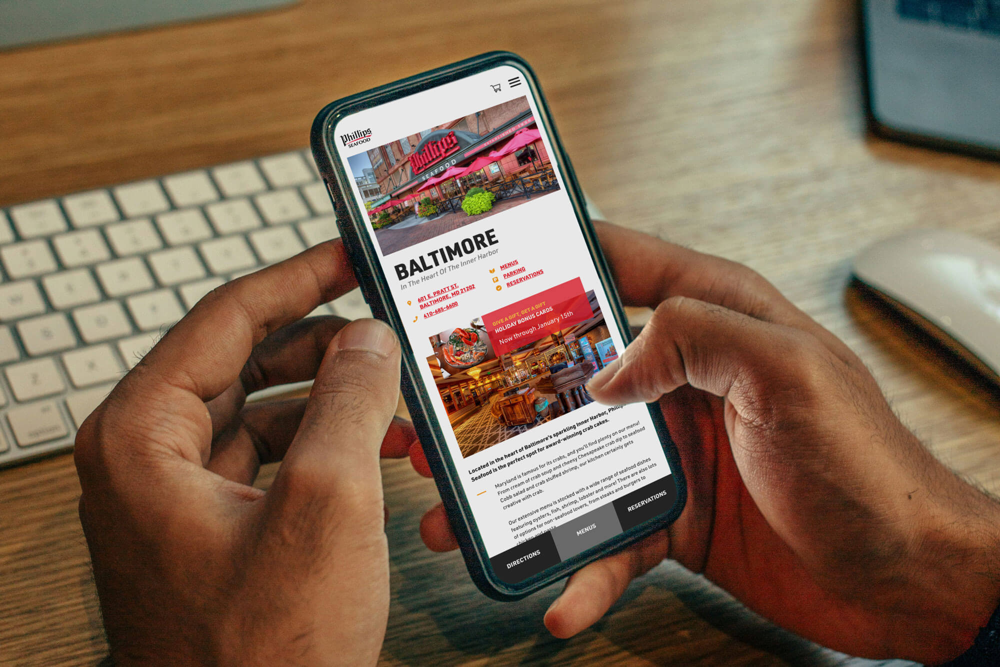
The Phillips Seafood web challenge was clear: create a cohesive shopping experience between the Restaurants and Grocery division websites. To support the different goals of both divisions, we created two distinctly designed sites and united them with seamless user experience.
Strategy
Userflow
Sitemap
Wireframes
Advertising & Social: Grocery Division
We took our time, mapping out user flow with logical paths and clear CTAs. We made it easy for users to make reservations, view menus, and get directions to the restaurant of their choice. If the anticipation of an upcoming reservation becomes too much to bear, they now have a clear path to search for local Phillips Seafood retailers, where crab meat, appetizers, and helpful recipes are waiting to be shared at home.
IV
Design & Development
Expanded the updated brand into the interactive realm.
With wireframes and navigation worked out, connecting these sites visually was the fun part. As always, ADA compliance was a huge priority, and our updated Phillips brand identity was created with this in mind. It always feels great to round-out identity work with web design because we can go wild with graphic elements, typographic hierarchy, and tone, demonstrating the full potential of the brand. Our development team stepped in to connect all the dots and helped Phillips step up their online ordering process. With a custom front-end catalog and Shopify integration, the new restaurant site can overcome geography, connecting Maryland ex-pats and crab lovers nationwide with the premium Phillips food items they desire.
Custom Frontend
Wordpress
Online Store
Shopify Integration
WCAG 2.0 Compliance