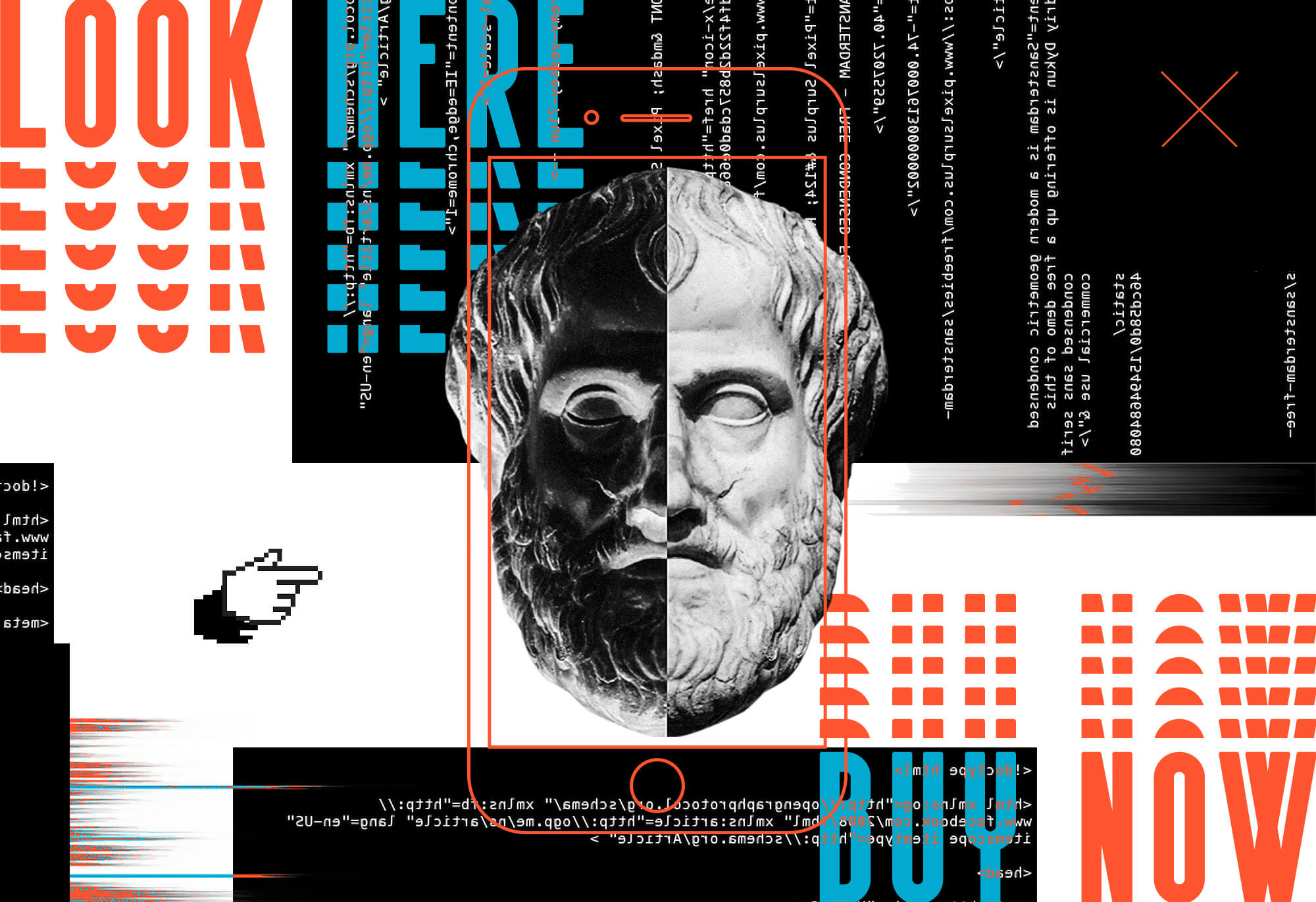
Your phone. Your tablet. Your laptop. Your TV. Your smartwatch. Digital media is more ubiquitous than ever. American adults spend an average of 11 hours per day reading, listening to, or interacting with digital media. As designers, we have endless opportunities to shape the experiences of this continuously expanding audience and we have far more reach than even just a decade ago. With so much social and psychological influence, there has been an increased focus on ethics in design. Social media has already been under fire for its targeted advertising and pervasive addiction, but design ethics span well beyond Twitter, Instagram, and Facebook.
Ethical design means considering the context of the product you create. It is about empathy for the audience you are designing for, and considering whether the design is helping or hurting them. It’s important to ask questions and carefully consider the message that is being sent into the world and how the world might use what you provide. Here are several topics to reflect on:
Long-term challenges of the industry you’re designing for.
A major player here is consumer-facing apps. Many applications focus solely on convenience and effort reduction. But at what cost? Is it adding to the culture of instant gratification?
There is also the added fear that design and technology is replacing more jobs than providing them. Some industries are simply overlooked in the tech age. But that doesn’t have to be the case. Take Uber Freight‘s a great example of shining a new light on an old but integral industry. There are approximately 3.5 million professional truck drivers in the U.S. alone. Uber has used its design platform to connect carrier and shippers and improve their efficiency.
Cultural benefits, social benefits, or costs of your design.
It’s important to think about how your design will be perceived in a cultural and social climate. Is it reinforcing gender or racial stereotypes? Or is it more inclusive and promoting equality? Is it promoting a positive and healthy message? Can it be used as a platform for healthy discussions and debates?
A brilliant execution of this is a mapping tool provided by newtactics.org. This visualization tool is used to help human activists develop a strategy and plan of action surrounding a specific issue.
Designing the product to be accessible and inclusive.
Too often, the less tech-savvy can get left behind when it comes to user interfaces. At its core, a design should be digestible and easy to navigate. Accessibility should always come before aesthetics. For example, https://www.audioriver.pl/ is a stylish and experimental site, but it comes at the expense of less accessibility. Navigation is not clearly marked or visible. An example of a better execution is https://nourisheats.co/, where navigation is overt and includes hover states to indicate what is an active link and how it can be interacted with. Slides also automatically transition in case nothing is clicked on, which helps educate the user.
Avoid dark patterns.
Dark patterns are methods of interface design that are blatantly unethical. They are used to trick users into taking actions they aren’t aware of or otherwise would not do on their own. An example would be automatically subscribing someone to an email newsletter upon visiting your site, but without their knowledge or consent. Another practice – given the name “Roach Motel” because it’s easy to get in and hard to get out – is used to make it extremely difficult for users to unsubscribe from a website or online service. Try to locate where you can deactivate your Amazon.com account and see how far it takes you.
The main principles.
A great summary of what ethical design should consist of has been established by a not-for-profit known as ind.ie, which focuses on building ethical technology that respects human rights, effort, and experience. They have created an ethical design hierarchy of needs.
In summary, a design should be a positive human experience, functional and reliable, and secure and accessible. With every opportunity to design something, there is also an opportunity to use it as a tool for positivity.

